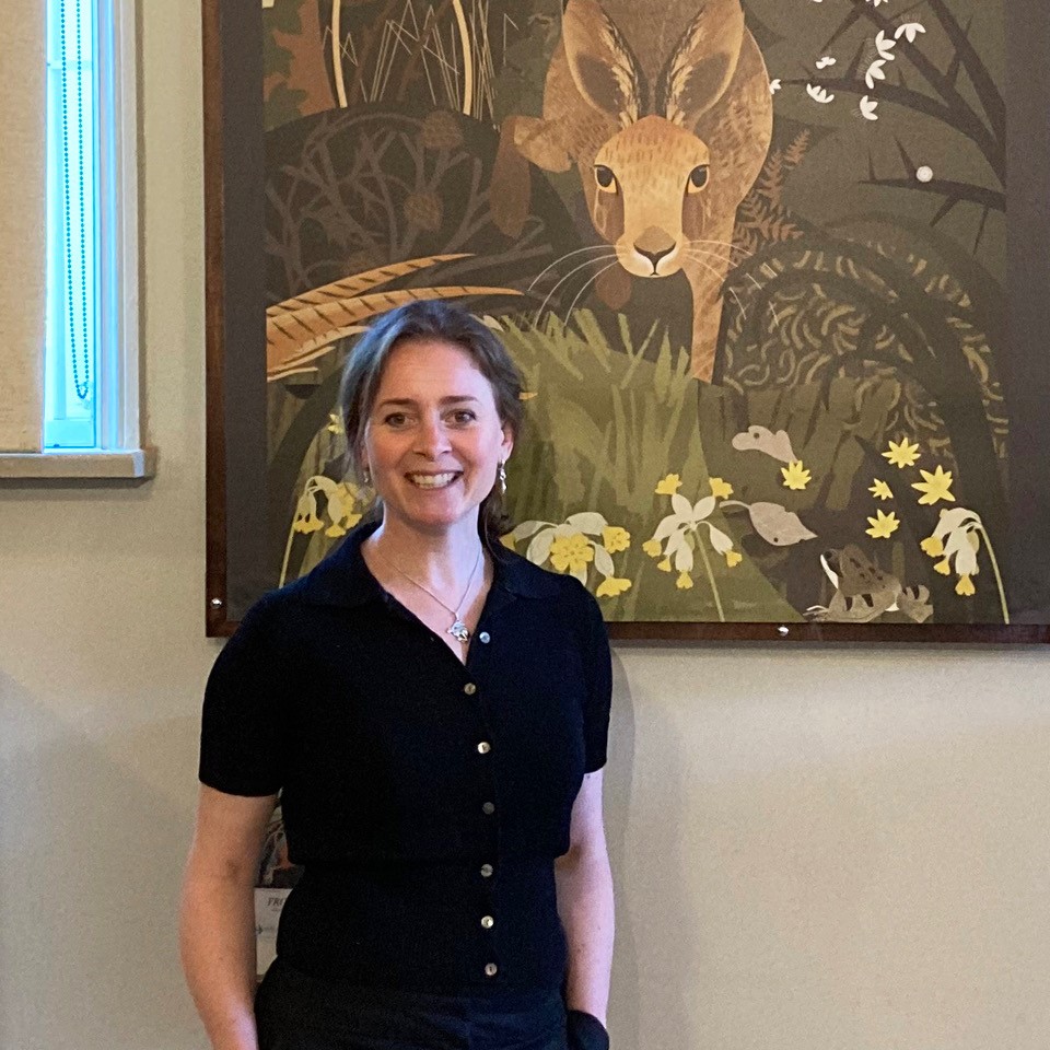
 Rachel Hudson is a natural history illustrator gaining wider recognition for her collaborations with conservation partners to champion species at risk. In 2022 she graduated with an MA in Illustration with full distinctions from Falmouth University. Since then, she has worked with the National Trust, Iceberg Press and is currently illustrating a book about the American crow for Greystone Books.
If you’d like to see more of my work, please follow me on Instagram @rhudsonillustration or visit www.rachelhudsonillustration.com
++++++++++++++++++++++++++++++++++++++++++++++++++++++++++++++++
Creating the Cover Art: the power of illustration to connect
As a freelance illustrator with an online presence, it’s not always clear how people discover my work. In the case of Pelagic Publishing, Nigel Massen spotted the cover I created for Cornerstones, Benedict Macdonald’s latest book published by Bloomsbury (and reviewed by Mark Avery here).

The cover art for Reflections has its roots in landscape-scale conservation. I have a background in conservation communication and worked alongside ecologists and environmental campaigners for nine years at the Berks, Bucks & Oxon Wildlife Trust. I try to weave that ambient knowledge into my images with the underlying aim of capturing the spirit of a place to help people connect with nature. There’s nothing more soul destroying than illustrating something you don’t believe in – so my illustration business is nature-focused and mission driven. (Last year, for six months I collaborated with progressive farmers to highlight the importance of ecologically-rich field margins.)
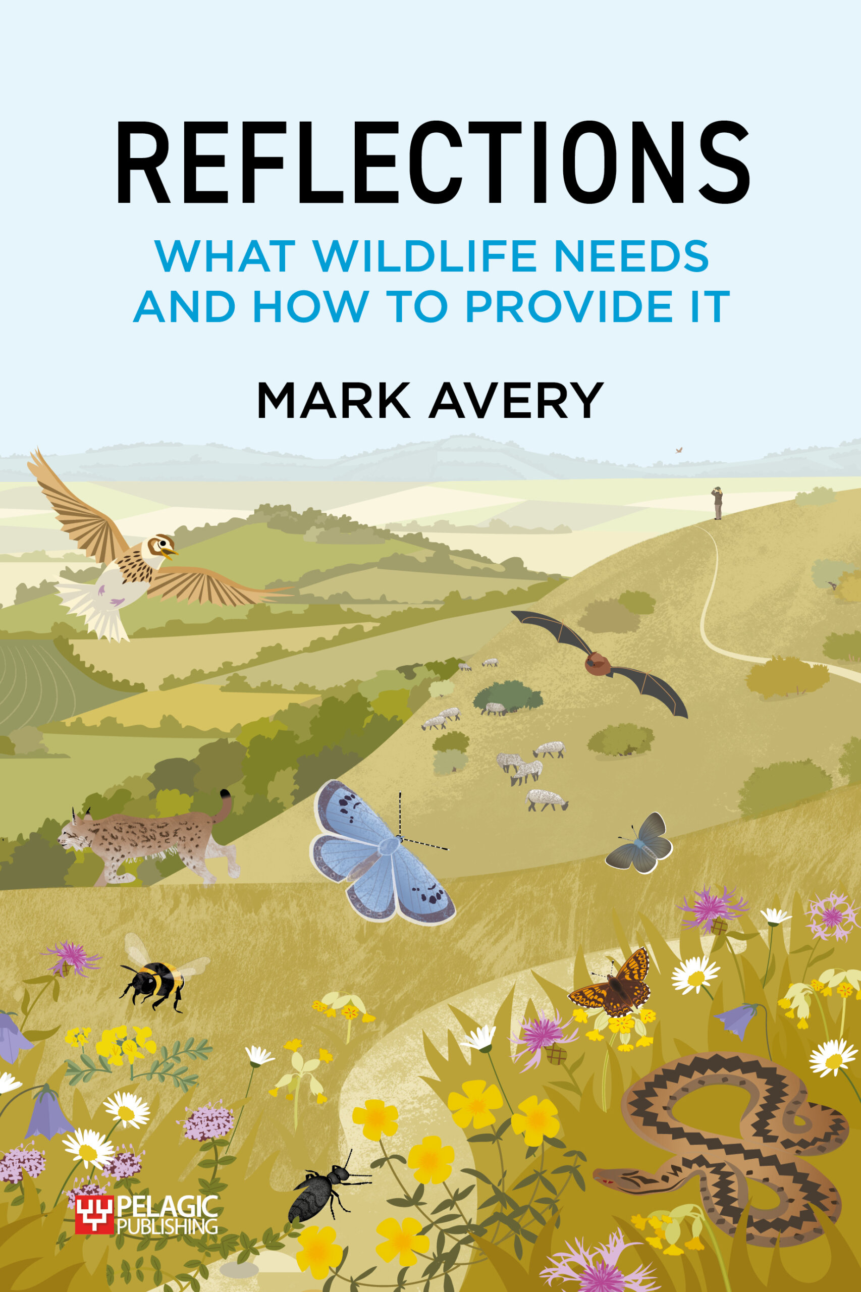
Reflections adopts a landscape-scale perspective. It is based on a Cotswolds view of a limestone grassland that I originally created for Butterfly Conservation’s Back From The Brink project in partnership with the Bat Conservation Trust. Beyond the slopes, the landscape encompasses arable fields and woodland with a person looking out across the expanse. The image is also packed with species big and small, from common rock-rose and wild thyme, to a Duke of Burgundy butterfly and a female adder. With input from the author, grazing sheep were introduced and a lynx exits stage left.
Practicalities also came into play when illustrating the cover. A softer colour palette was adopted, not only to evoke a warm summer day, but to enable to title text to stand out. Apparently unusual for a natural history illustrator, I combine analogue and digital techniques to create my images which are characterised by clean shapes and rhythmic compositions. Hand drawn marks enable me to incorporate texture for added depth and interest, while the digital component of my process allows for flexibility. I can change individual elements without having to redo the entire illustration.
Reflections is an important book. I am delighted to have played a small part in encouraging readers to read it (and hopefully act upon it).
If you’d like to see more of my work, please follow me on Instagram @rhudsonillustration or visit www.rachelhudsonillustration.com
[registration_form]
0 out of 10 for the illustration as the person with the binos is looking the other way [must be Mark!] when all the wildlife is actually this way!!
I’m delighted that Rachel Hudson illustrated your book, Mark. She also judges our children’s wildlife art competitions and lives a short distance from me in Four Marks. Recently she had an exhibition of her artwork, a project for the Selborne Landscape Partnership entitled, ‘From the Margins’. I am presently carrying our surveys for the SLP on farmland. Our last competition for school children was entitled ‘Pondlife’. The winning entries were exhibited at Gilbert White’s House Museum, The Allen Gallery, the Phoenix Theatre and at the Ecofair in Alton arranged by ACAN.
Diana – interesting background, thank you.