I am a fan of Birdtrack (more correctly BirdTrack but I can’t be bothered with that ‘T’) – I’ve said so many times on this blog. In fact I was involved in helping set it up when at the RSPB, and Birdtrack is still a collaborative enterprise with the BTO in the lead.
Introduction to Birdtrack
What is Birdtrack? It’s an online repository of bird sightings. As a birdwatcher, like me, you can enter your records into Birdtrack (where? what? when? how many?) and they become part of a common pool of observations, but you can always access your own observations to have a look at them. So, for me, Birdtrack replaced a notebook – when I go birding for the day I record the birds I see on my phone and upload them. I can then, after a visit to the coast, say to Titchwell RSPB nature reserve, see when was the last time I saw a Kingfisher there or how often I see Sanderling on the beach. It’s all online and I don’t have to find notebooks or decipher my writing to have a brief look at my birding history.
But if lots of people do the same sort of thing then it’s possible to use all of our observations in a more interesting way. One can look at arrival dates of spring migrants – right across the country – as an example. And compare them from year to year. If you have an army of fairly competent observers, who make lots of lists of birds seen in places, then one (preferably a bunch of boffins who understand the limitations of the data) can potentially do a lot of interesting analyses.
Lockdown and Birdtrack data
Today it’s raining, and the forecast is for rain most of the day. So I’ll spend less time sitting in the garden looking at birds flying over and thinking. But one of the things that I have been thinking about is Birdtrack. Now usually my Birdtrack lists for this time of year would consist of very frequent visits to my local patch of Stanwick Lakes but I have only been there once in the last six weeks or more. Instead, I have completed a garden Birdtrack list most days – you can see the results from the first four weeks here (and Birdtrack made it very much easier to put this together).
There are lots of other birders, and maybe some normal people too, doing the same. So I’d expect there to have been a shift in emphasis of Birdtrack lists from ‘places where birders go birding’ to ‘places where birders live’. Can we see any evidence for that?
After a bit of meandering through Birdtrack this morning I realised a good place to look would be the House Sparrow data. House Sparrows are common, but they aren’t common everywhere. I have very very few records of House Sparrow at Stanwick Lakes but I have seen a House Sparrow on every one of my lockdown bird lists at home over the past weeks. Surely the percentage of lists containing House Sparrow will have gone up during lockdown as birders stay at home (seeing lots of house Sparrows, on average) and go out less (where fewer lists would contain House Sparrows, on average). Well, is that true?
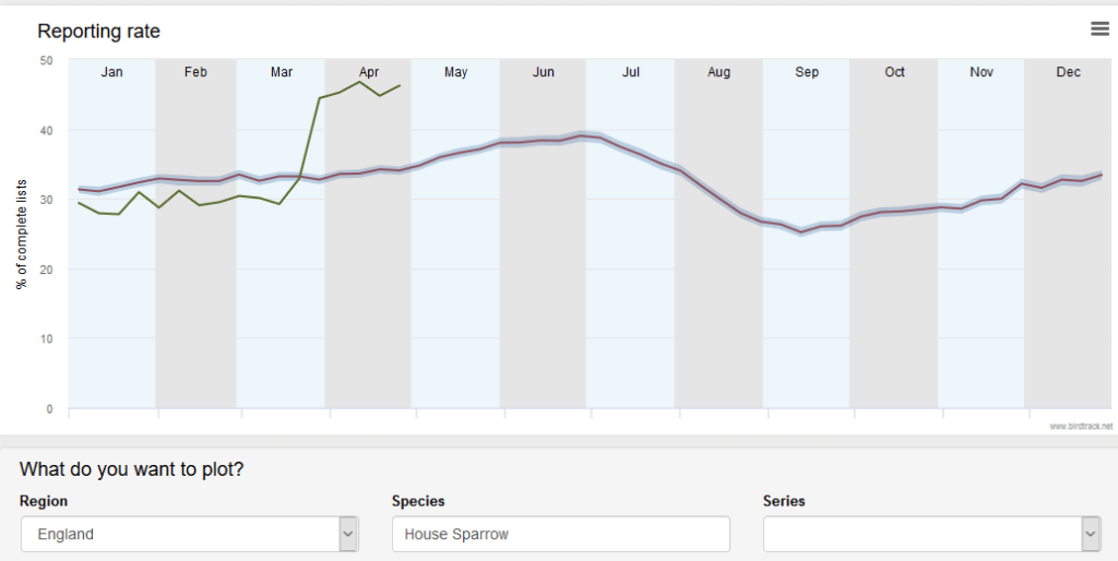
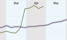
Yes it is! The thick line above is the historical trend in House Sparrows in complete lists over many years and plotted by week through the year. It stays at between c25% and c40% through the year with a dip in July-September. Why does it dip in July-September? I don’t know but it must be because either House Sparrows are present but are less obvious during those months (they make less noise, they visit feeders less, they hide in bushes moulting, they are active at times of day when people aren’t – somethings like that) and/or people who submit Birdtrack records go to different places and those places have fewer House Sparrows (we all go to the coast and look at waders and seabirds and see House Sparrows less often or something like that). I expect there are other possibilities too. But the important thing is that there is a well-established pattern of incidence of House Sparrow in complete lists on Birdtrack (and there isn’t much variation from year to year as the historical line has a little grey cloud around it showing that – but the little grey cloud is so close to the line that you probably can’t really see it above).
But the line for this year starts off below the historical average, consistently so for several weeks at the beginning of the year but then leaps up when lockdown starts and has stayed high ever since. I’d be interested to hear any competing explanations for that shift in line other than lockdown. And remember that the leap is likely to be partly because more lists are being submitted from homes with House Sparrows but also because fewer lists are being submitted from ‘other’ types of place, like Stanwick Lakes, where House Sparrows are unusual.
Neat!
But we can go further. The first thing to do would be to see whether other ‘garden’ birds show a similar pattern – many do. You can look yourself at the BTO site but Blackbird, Blue Tit, Great Tit, Greenfinch Starling and Robin show similar-ish patterns.
Neat!
And we would expect that some species would show the opposite – the species I have to go to a nature reserve to see will have dropped in representation – you’d think wouldn’t you? Or coastal species?
Here are some examples chosen specifically to illustrate that point (not to test it, but to illustrate it):
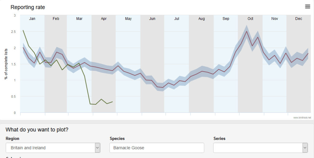
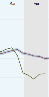
That’s pretty convincing for Barnacle Goose! When lockdown starts Barnacle Geese drop dramatically out of lists (or maybe they do, remember they could simply be swamped by garden lists contributed at a much higher rate).
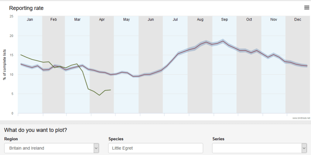
Little Egret is similar. Let’s try a seabird;
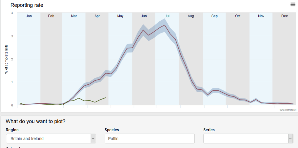
Puffin (you don’t get that on many garden lists) – shows the same type of pattern.
Where we have got to so far is that unless there has been a remarkable change in bird behaviour, these graphs show the change in birdwatcher behaviour over the last few weeks. That’s quite interesting – a biological recording scheme is measuring changes in human behaviour. How neat!
But a consequence of this is that the historical average lines from the past will be influenced by the lockdown lines of this year in future – unless they are excluded from the data in some way. Either way, there is a thing to think about there (and I have no doubt that BTO boffins are or will be thinking about it).
I think there might be an even more interesting thing that could be looked at with these data – I can’t do it but those with access to the data could (maybe they have, or maybe they will).
Although we are rather patronisingly thanked by politicians and government scientists for complying with lockdown guidance there is a growing feeling that people are slipping a bit in compliance. That might be because the British are a bolshy lot and/or it might be that people are a bit confused by what they are supposed to be doing. But birders are, in some ways, normal people, but in some ways are a type of person who is likely to want to get back to normal as quickly as possible – and so might cheat or bend the rules.
If so, then deviation from historical average during lockdown might lessen through the lockdown period. So House Sparrow incidence might remain high, but be getting progressively less deviant from the historical norm as time goes on. Does it?:
Not convincingly – although what you are trying to assess is the difference between the green line and the dark line which is a little tricky by eye. And in any case, the last week’s data point may change as people enter data after the event.
How about Little Egret?
There’s slightly more indication there – do you think? But the same caveats apply.
If I had access to the data, and the time and inclination, I would compare absolute deviation (ignoring whether it is positive or negative) from historical line (actually you need something more sophisticated than that) by week for all species and see whether there is a trend through lockdown. I might leave it another week or two though.
[registration_form]
I said lockdown should be an opportunity for interesting research on human and animal or plant interaction. I hope those with the opportunity are making the most of it. It’s clear that Birdtrack is one source of good data.
Did the year of Foot and Mouth make some difference to the results? If so, maybe the info this year will be treated in the same way that was? I’ve restarted entering lists on the site again! Hadn’t used it much in recent years, but local walks at 06.00 have set me off again!
Hi Mark,
You say:
(and there isn’t much variation from year to year as the historical line has a little grey cloud around it showing that – but the little grey cloud is so close to the line that you probably can’t really see it above).
The grey cloud is the confidence interval of the long term trend. The historical variation would be a much wider grey cloud, and would be much more use in my opinion. Who the hell is interested in the confidence interval?
Dick – I agree, not many people. My preference is to see the real data too. But in this case, the confidence interval isn’t bad.
You can manually create your own plots with different years on if you like. Whilst logged in, go to Explore Data -> Reporting Rate and create a plot as you’ve done above. Then in series choose 2018 and instead of show graph click the blue “add plot” button. Repeat for as many years as you are interested in. It can get a bit messy, but can be interesting. e.g. House Sparrow with a few recent years on: https://tinyurl.com/yc6f2s6r
Teresa – thank you, I hadn’t realised that. There are still bits of BirdTrack that remain unexplored by me
A BTO blog from earlier in the year was updated in mid April discussing the lockdown effect on reporting rates: http://bit.ly/BTODataBlog – note “While popular among birdwatchers for quick comparison, the simple reporting rate graphs were never intended to serve as a robust population assessment tool.”