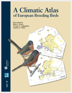
 Last week I was thinking a bit about climate change and birds and thought I’d had a good idea. And I had had a good idea – it’s just that others had had it too and published a paper on it two years ago!
The good idea was to look at the ‘envisaged potential’ bird distributions which were modelled in the Climatic Atlas of European Breeding Birds and see whether they were supported by recent bird survey data from across Europe. Are species which were envisaged to increase their breeding ranges actually increasing in those places and are those that were envisaged to lose distribution actually declining in numbers in those places?
Well, this was looked at in a paper in Science a couple of years ago. I’ve looked at the paper and it”s very interesting but it’s behind a paywall, and although I think (their system is very complicated!) I’ve asked Science for permission to use one of their figures from the paper I haven’t had a reply so I’ll just describe it in words!
The authors used Europe-wide EBCC bird monitoring data to make an annual multi-species index (analogous to the farmland bird index for UK) of populations of species that ought to be increasing according to atlas-type models, given observed climate change. And they made another index for the species that the models say ought to be decreasing. Note that the trend prediction, based on the model and observed recent climate change, is made for each country separately for each species, so for example, the Dartford Warbler population data for the UK contributes to the indicator for species that ought to be going up and the Dartford Warbler population data for Spain contributes to the indicator for species that ought to be going down.
So, what did they find? On average, populations of species that ought to go up are approximately stable (not increasing) but populations that ought to go down go down a lot. There is a real difference across all species and countries between species predicted to do well and those predicted to do badly – that’s quite impressive. In fact it’s very impressive considering all the other things that are going on.
But the researchers were a lot more ambitious and cleverer than that! They repeated the analysis for birds in North America (this was a massive undertaking – I’m very impressed) and found that populations of species that ought to go up, go up a lot and populations that ought to go down are approximately stable. So again, there is a real difference in the way that envisaged increasers and envisaged decreasers actually behave and those differences are in line with actual climate change.
But the researchers did something even cleverer. If you plot the ratio of the ought-to-go-up index to the ought-to-go-down index against time, the results for USA and Europe look remarkably similar. If the DIFFERENCE between the two groups of species is due to climate change, this similarity of the index ratio plots between USA and Europe is exactly what you’d expect, because warming has occurred to a similar extent on both continents . That’s another line of evidence in favour of these trends being driven by climate change.
The results imply that things other than climate are, on average, worse for birds in Europe than they are in the USA. Interesting.
The Science paper is Consistent response of bird populations to climate change on two continents by Stephens and an awful lot of al.s
[registration_form]
this is something we are currently about to look at here in The Gambia W Africa (with external co operation) using 1st arr & last dept dates for pal migrants – we have data sets from 1965 – 70s, 80s & 90s to 2017 & we will add a few intra African migrants whose movements are assoc with our rains – bws CrB : Recorder The Gambia
“The results imply that things other than climate are, on average, worse for birds in Europe than they are in the USA. Interesting.”
Human population density?
Europe: 188 people per square mile
USA: 91.1 people per square mile.