Following on from an earlier blog.
Maybe we’ve decided that once-common birds that live on farmland don’t matter to us any more (but if we have, when did that happen and I’m not signed up to that view) but we must care about the best places for wildlife and priority species – surely?
So let’s have a look at their graphs.
And let’s start with species as that graph is not difficult to interpret – it’s a strong and continued decline.
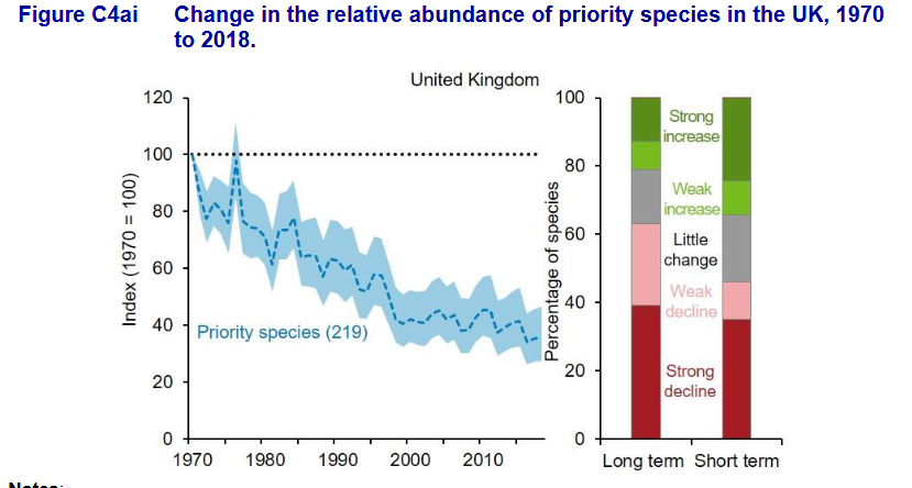
Apparently things were slightly better from 2013-18 than over the longer period but if you take any comfort from that I think you are foolish.
This is the fate of priority species which government and its agencies have decided are … priorities! You’d have to wonder what the fate of the non-priority species might be! Actions to conserve these priority species are included within the respective countries’ biodiversity or environment strategies. Well, hello! Is anybody there? Those actions aren’t working are they?
If this were educational achievements for priority children or recoveries of priority patients there would be hell to pay but it is a sign of how little wildlife means to ‘us’ that even priority wildlife can be going down the drain, and government publishes reports saying so, and it is a matter of no great import.
Many priority species live on ‘protected’ areas such as SSSIs (ASSIs in Northern Ireland). How are they doing?
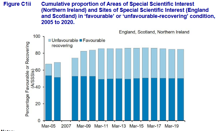
On the face of it, this doesn’t look bad; about half of sites are in favourable condition. But that does mean that half of these priority sites are not in favourable condition at all. Are you a glass half-full or half-empty person? I think I ordered a full glass and have been given short measure for years.
But then, a lot of the unfavourable sites are classed as unfavourable recovering so that sounds good. Just reading off the graph it looks like about 35% are in this ‘apparently getting better’ category. Two points here. First, a point I have made here many times over the years, Unfavourable Recovering sometimes means that the habitat is recovering but often it means that there is a plan, a bit of paper, which if implemented well will lead to recovery. But second, this time series shows us that not much is happening because we would expect sites to transfer from Unfavourable Recovering to Favourable over a decent period of time, say a decade, if the system works like it sounds as though it should – but they aren’t.
Recovering sites, once recovered, would move from the light blue bars and become parts of the dark blue bars – but this graph helpfully demonstrates that in net terms that isn’t happening. So you really can forget Unfavourable Recovering as a good sign because there is no net increase in ‘recovered’ sites.
And our statutory agencies don’t actually have good information on these matters anyway these days so the quality of the data is poor and seriously out of date. Why aren’t the NGOs hiring all those ex-NE staff to go out and assess SSSIs to throw a light on what is really going on? I don’t know – you’d better ask them.
So, priority species are in continuous serious decline and priority habitats are not improving with time. That doesn’t sound to me as though state nature conservation is working very well.
There is some good news too – back later.
[registration_form]
The situation is even worse for our sites of European importance than it is for SSSIs. The indicators show approximately 70% of these sites as ‘unfavourable-stable’ (i.e. not improving) or ‘unfavourable-declining’!
Correction – this indicator does not apply to ‘sites’ but habitats. Not that that makes it any better.
For info – NE hired a few highly skilled but furloughed NGO staff on short contracts this summer to undertake some SSSI condition monitoring. This was a good use of skills that NE do not have enough of themselves.
It is also important that NGOs do not pay for formal SSSI monitoring as this is a statutory duty, so has to be resourced by the Government Agencies. Sadly SSSI condition monitoring has been almost abandoned by NE for many years, which is the main reason Fig C1ii has flat-lined.