Following on from two earlier blogs (here and here).
Thezse two indicators from the marine environment look like they are going convincingly in the right directions – but this is defibnitely not my area of expertise so if you think differently then shout, please!
A squinting glance at the table of ticks and crosses at the front of the report would seem to suggest that the indicators that relate to actual numbers of real animals and plants on the ground are mainly associated with red crosses whilst the green ticks are more heavily associated with the nebulous indirect indicators such as ‘percentage of forest certified’ and ‘hours of volunteer time’.
That would surely be an indication that whatever it is the government believes it is doing to protect biodiversity in this country it is either ineffective or insufficient or both.
Jonathan – that was what I thought too!
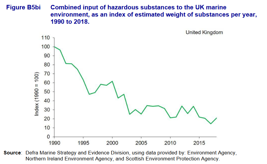
Figure B5bi: Inputs to the sea are estimated from rivers, estuaries and coastal point sources, so reflect the contribution from UK land to sea.
We can have a warm comfy feeling about the direction of travel for an estimate of our combined output of a small selection of hazardous stuff by weight, but it would also be good to know what the trend line looks like for your actual Sea which is also receiving hazardous stuff draining from everywhere in NW Europe and Scandiwegia.
Regarding the suite of indicators, persistent organic and biologically active stuff is under-represented, IMHO, and – like pesticide usage data – basing the index on weight rather than toxicity ignores reality.
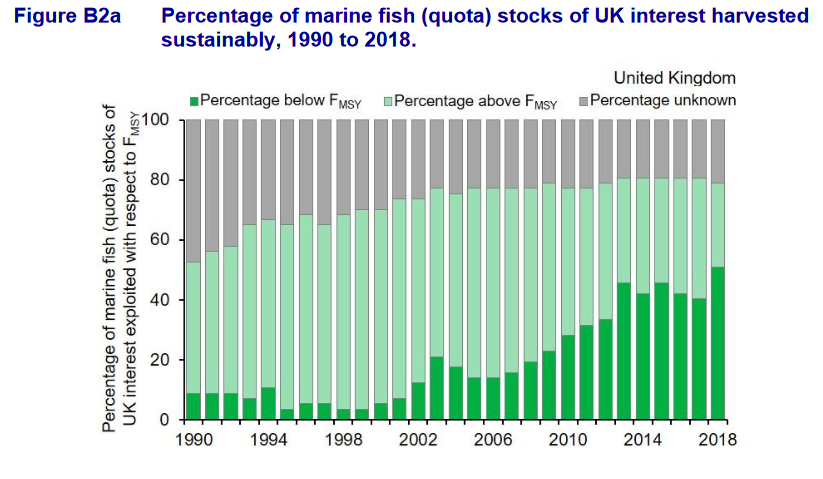
The percent hazardous seems to have stopped declining, so not so good there. Also, is the % of stocks the % of species (each species counted once) or % of (?)estimated biomass? Might make a massive difference.
M parry – you could follow the link and find out…